What’s new in version 2.43
The Mobile Event App starts the new year with version 2.43. Enclosed you will find an overview of the current developments and improvements:
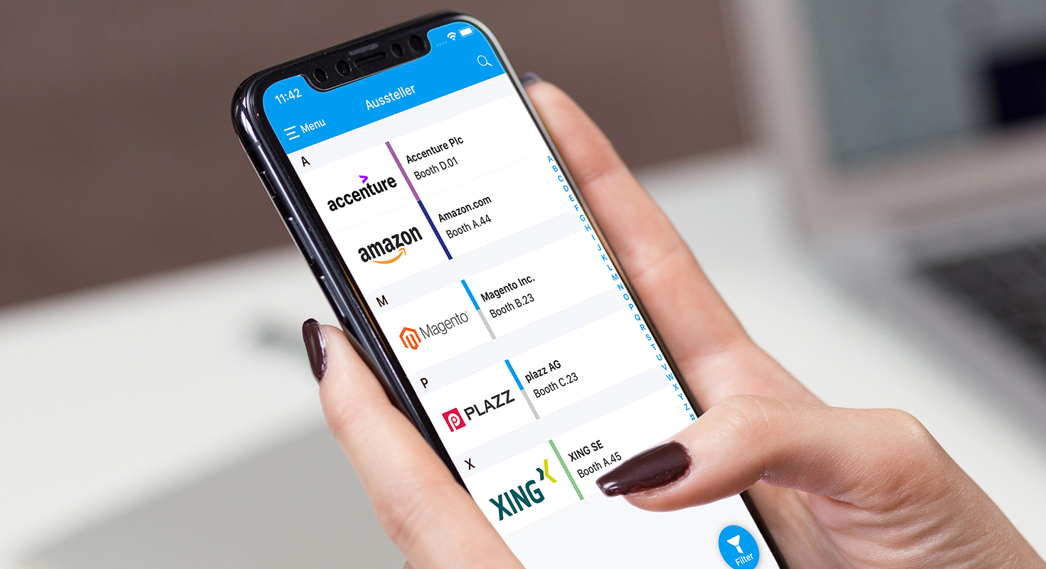
Graphic Revision of the exhibitor list
An exhibitor list is mandatory for many of our customers and is now up to date according to the MEA Design Guidelines. Both the list view and the corresponding detail view have been revised. In the CMS the organizer can now create and assign categories in addition to the product groups, which requires simple filtering in the apps. Furthermore there are some optical improvements, like the display of the company address on an interactive map and a general adjustment to the design of the agenda and the person detail.
Show Gamification in the app
For organizers who use the gamification feature, but do not want to make information such as high score etc. publicly visible, there is now the possibility to show or hide the visibility in the CMS.
Mandatory fields in the participant profile
From version 2.43 on App Managers are authorized to set the single and multiple selection in the participant profiles as mandatory fields. This guarantees that the organizer can demand certain information from the participants (food preferences, allergies, preferred travel options, etc.) in order to improve the event experience in the long term.
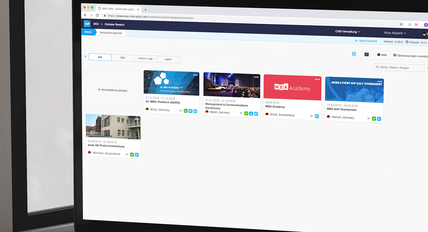
Convention list in the CMS
The overview of events in the CMS has been optimized: The app manager can now create events on a global overview and decide which of the products we have purchased he wants to unlock for them. In one go, the corresponding information is requested and the event is created. The order of the elements has also changed optically in order to create clarity about functions and core information. By clicking a button you can switch between a list view and a tile view.
Accessibility
With 14 DAX companies using the MEA as a corporate app, we have high demands on our solution in every respect. This also applies to accessibility, which we have further expanded: Interactive elements and buttons have been revised to such an extent that even limited users will not experience any problems with operation. With the tag distribution in the matchmaking feature, the display is broken down to a list, for example, in order to be interpreted as simply as possible by screen readers.
Check-In App
During the last months plazz AG worked under high pressure to modify the Check-In App and to launch a completely new version on the market. In addition to a complete graphical revision, the functional range was extended by several points, e.g. the possibility to check-in into individual subsessions or the check-out of workshops/rooms. In the next few days we will publish a whitepaper as well as a video – if you are already interested in a customized offer, please contact our CEO Mr Jürgen Mayer (jm@plazz.ag).

